Bar Charts
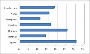
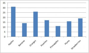
Bar charts are generally used to differentiate between the values of a parameter for buckets of data. The length of the bar shows the relative value of that data point.


That just means that the bars represent a group, such as types of fruit in these examples, and the longer the bar, the higher the number. The parameter can be anything—number sold, acres planted, or people choosing it as their favorite fruit.

The key is to make sure that the boundaries of the buckets are known and are constant across all categories. Apples and oranges sold should be for the same time period, for example.
A histogram is a specific type of bar chart where the buckets are set up along intervals on a scale, like students test scores (71-75, 76-80, 81-85, and so on). A Pareto Chart is a bar chart where the categories are sequenced from high to low.
The naming convention for this chart varies—Microsoft Excel calls the horizontal graph a bar chart and the vertical graph a column chart, but most people refer to both by the term “bar chart”.
You might also see clustered data—for example showing side by side bars for apple and orange sales in each quarter over of a year.
Bar charts are one of the stalwarts of Lean efforts. They are relatively easy to produce, and are easy to interpret, even with very little familiarity. Since Lean is very goal oriented, you will frequently see bar charts with a threshold line on it. Make sure to label that line so it is clear which side of it you want your data to fall on—the “good” side. Sometimes below the line is the goal, such as for hold time for your call centers. Or good can be above the line, as in scores on a customer satisfaction survey.


0 Comments