Run Chart
A run chart is a tool used to show a change in a value over a period of time. It depicts a time-ordered series of data plots with time on the X-axis (horizontal) and the value of the data on the Y-axis (vertical).
Run charts are particularly powerful because they showcase changes that otherwise may be too subtle to notice. These changes are, in many cases, linked to abnormal conditions which can be quickly dealt with.
They are also powerful because they can track data in near real time. Most other tools look at information after the fact. Run charts can be appended with the most recent data added to the end of the series. This immediacy leads to rapid problem solving, often before problems grow.
One final benefit of run charts is that most frontline leaders are capable of creating and using them to solve problems. The actual gathering of data and updating the run chart takes very little expertise and can be done by most people on front line teams.

While most problem solving efforts in Lean loosely follow the PDCA cycle, there are a variety of tools you must use within that structure to effectively analyze a problem. The run chart is one such tool. It is extremely valuable in both problem identification and in root cause analysis.
The power of a run chart lies in its visual nature. The impact of a graphical representation of a data series carries a much greater visual impression than a series of numbers.
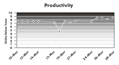
For example, look at the graph below, and try to quickly identify when changes occurred. Two things should stand out.
- There was a significant dip on the 18th of March. This was likely due to some sort of problem that happened on that day.
- Something happened on the 24th or 25th of March. The data series had a stepwise increase. In all likelihood, this was due to kaizen A kaizen will frequently result in a stepwise change, meaning that the slope of the line stays flat, but the values are reset at a new level. In this way, a run chart can confirm whether a project was successful, or if it broke a process.

The two indicators shown on this graph are the most likely conditions you will see when using a run chart to track a process on an ongoing basis. In a Lean environment, these two indicators are also the most useful. The first highlights abnormal conditions and gives you an opportunity to make a process improvement. The second is a vital part of the PDCA cycle. When making a change you must check to see whether the results are as predicted. A run chart makes it easy to do so.
Run Charts vs. Control Charts
Run charts are very simple to create and to use. One of the drawbacks of this simplicity is that common-cause variation can look like a change in a process. Every operation has variation to it. Some of that variation is inherent to the system. That is called common-cause variation, or noise.
Think of an icicle melting from your gutter. Most of the drips will fall in a very small area, but they will not be in exactly the same space. That tiny bit of fluctuation happens without any external stimulus. That is common-cause variation.
On the other hand, a gust of wind or a large truck driving by or a slamming door can all affect how that drip will fall. That type of variation is known as special cause.
When there is a large degree of variation in the system, common-cause variation can look like a special cause. The result is that a person may spend considerable resources trying to chase down something that does not exist. That’s not to say that you should never go after reducing common-cause variation. It is just important that you know whether you’re trying to make a systemic change or are trying to fix something that is happening outside of the defined process.
A control chart is like a run chart on steroids. It uses statistics to create control limits that isolate the common-cause variation from the special causes. These take considerable expertise to set up and maintain, though. Because of the costs to set control charts up, they are typically used sparingly and in situations where the cost of failure is high.
Fortunately, in most cases a run chart will be sufficient for your needs. Combine that with the fact that run charts can be set up by people at all levels, and you have a very powerful Lean tool.
What to Watch for on a Run Chart
As mentioned earlier, the occasional blip on a run chart is often a result of common-cause variation. Significant spikes, however, should be looked into.
In addition to the obvious outliers, there are several other patterns to watch for on your run charts.
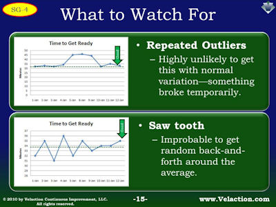
- Repeated outliers are highly unlikely. Several data points in a row that are significantly off the average is likely not due to randomness. It generally means a process broke for a short period of time and then returned to normal.
- A back-and-forth pattern is also very unlikely, especially when it crosses the average line as it goes up and down. This situation is uncommon but can happen when a process is hard to dial in and is overcorrected repeatedly. In some cases, a dual process (see below) will exhibit a saw tooth pattern if the timing is just right.

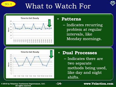
- Patterns are indicators that something unusual is happening on a recurring basis. For example, test scores may be lower on Friday than on other days for students, or productivity may be down on Monday morning on a production line.
- Dual processes show up as a distinct split in data points. This might happen when different teams manning a process each have their own way of doing things. You may see something like this when there are multiple shifts staffing an assembly line. With different processes, each shift would have its own normal range for the data.

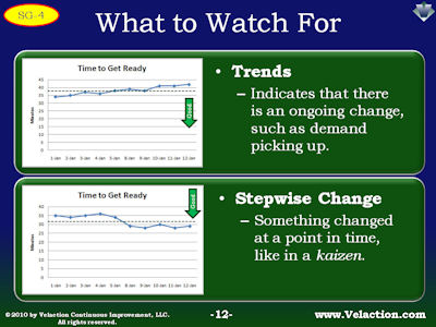
- Trends are an indicator that something is continuously changing. The most common situation where this occurs is when demand is rising or falling, or when a machine is slowly wearing out. Most operations, though, have more stepwise changes in performance as projects are completed. Upward performance trends are fairly uncommon.
- While trends are uncommon, stepwise changes are not. When a process is changed whether for better or worse, its performance resets to a new level.

![]()

Words of Warning About Run Charts
- Trends are an indicator that something is continuously changing. The most common situation where this occurs is when demand is rising or falling, or when a machine is slowly wearing out. Most operations, though, have more stepwise changes in performance as projects are completed. Upward performance trends are fairly uncommon.
- While trends are uncommon, stepwise changes are not. When a process is changed whether for better or worse, its performance resets to a new level.

On occasion, you will be asked to update run charts. If nothing is done with the data you collect it can be very frustrating. If you are lucky, though, the run chart will lead to assistance in solving problems.
Sometimes, you will need to nudge the continuous improvement process along. Learn to identify the indicators on a run chart. You can even note the problems that you find directly on the chart. More importantly though, when you do see a problem, get the ball rolling. Try to identify the root cause or at least gather more information that can help with that analysis.
The more involved you are in the follow-up to problems the run chart uncovers, the more likely you are to see positive change.

Like all data collection efforts, be sure to do something with the information you gather. Few things are as frustrating for a team member as collecting data for no reason.
Fortunately, though, run charts provide information that is hard to ignore. When you see the highly visual issues that show up on this problem-solving tool, it becomes a conscious choice not to act. Run charts peel back the excuse of ignorance.
One good way to make sure run charts are acted upon is to post them publicly. It is easy to ignore a run chart that is sitting in the bottom of a desk drawer. A run chart posted on a wall demands attention.
One thing to consider before you start collecting data, though, is whether you have the resources to do something about the problems you uncover. Think a few steps down the road. If you are limited in your continuous improvement resources, focus your efforts on just a few areas. As you free up more time through productivity increases, you will be able to expand the scope of what you monitor.

Key Points about Using Run Charts
- Run charts provide a visual representation of data. This makes patterns far easier to identify.
- The straightforward nature of run charts makes them easy for frontline employees to create and update.
- As you grow accustomed to using run charts, the patterns you see will start to point you in specific directions for your root cause analysis.
![]()
Practice two different types of run charts. Start by identifying a process where there is some stability. The goal is to learn how to integrate data collection and recording into an operator’s workload. Be sure to document the run chart process. These instructions should include where the chart is posted, how data is collected, who collects it, and when the run chart should be updated.
Once you have ironed out the kinks in a basic run chart, move on to an area where you are having sporadic problems. Depending upon the pace of production and the duration of problems, you may need to adjust the data window to get actionable data. Keep in mind that hourly data points will help you identify issues right away but tend to be time consuming to update.
An important part of the education process is to go over lessons learned. Get some time on the calendar for a mentor to discuss the results of the run charts with the people who gathered the data. Focus the discussion on obstacles and in ways that run charts can be used more effectively in the future.


0 Comments