Histogram
A histogram is a specialized form of bar chart that shows the distribution of the data it is representing.
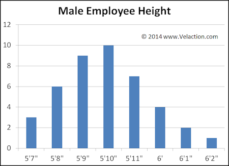
Each bar represents a uniform range of data values, with the height of the bar showing the number of occurrences that fall into that range.


Because a histogram shows a distribution, it is best suited for data with continuous numerical values that fall within a specified range. In the example above, for example, a person could have a height at any value within a set spectrum. In this case, the vast majority of the population ranges from 5’7 to 6’2″. Obviously, each individual will not fall precisely on the number shown. One of the people in the 5’11” bar might be 5’10.934″. Another might be 5’11.242″. The point is that the data can fall anywhere within the range.
The histogram is not suitable for unordered data, such as types of pets.
Interpreting Histograms
The shape of a histogram tells a lot about the data set. It might be a typical normal distribution (bell curve), which indicates that most of the variation is caused by common causes, or natural randomness in the system. It may also be skewed to the left or right, be bimodal (two-humped), or even multi-modal. On rare occasion, it will even be symmetrical or appear random.
Each of these shapes tells us something about the underlying process that created the data.


0 Comments